The Proof-Sheet Palette: Why American Experimental Shorts Are Grading in Fewer Colors
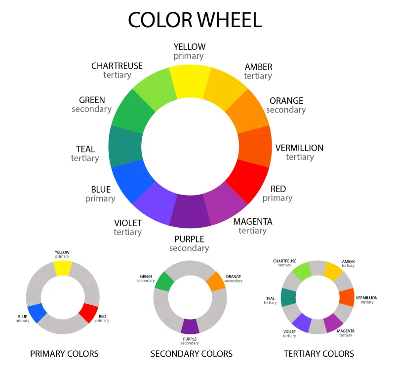
Photo: color grading suite with printed color swatches and woodcut proofs, experimental film production, via i.pinimg.com
Limited-palette grading has moved from a niche affectation to a working method in American experimental short film. Directors and colorists are increasingly building looks around two or three inks rather than a full spectrum, and they are testing those looks on paper before they ever touch a timeline. The appeal is not simply retro. It is structural. A restricted palette forces decisions about hierarchy, contrast, and duration, and it gives a short film a visual grammar that can be explained, defended, and repeated.
The best of this work does not look impoverished. It looks deliberate. A bone-black shadow, a warm paper white, and a single accent color can carry a fifteen-minute film if the accent is used with discipline. The color suite becomes less a place for endless adjustment and more a proofing bench: mix, print, inspect, revise.
The Bench, Not the Button
Colorists interviewed for this piece describe a shift in posture. The question is no longer what the footage can be made to do, but what the film is willing to allow. In practical terms, that means building a palette before the grade begins. Directors arrive with printed color scripts, swatch cards, and sometimes actual woodblock proofs. The colorist's job is to translate those physical references into a digital pipeline without sanding off the evidence of the hand.
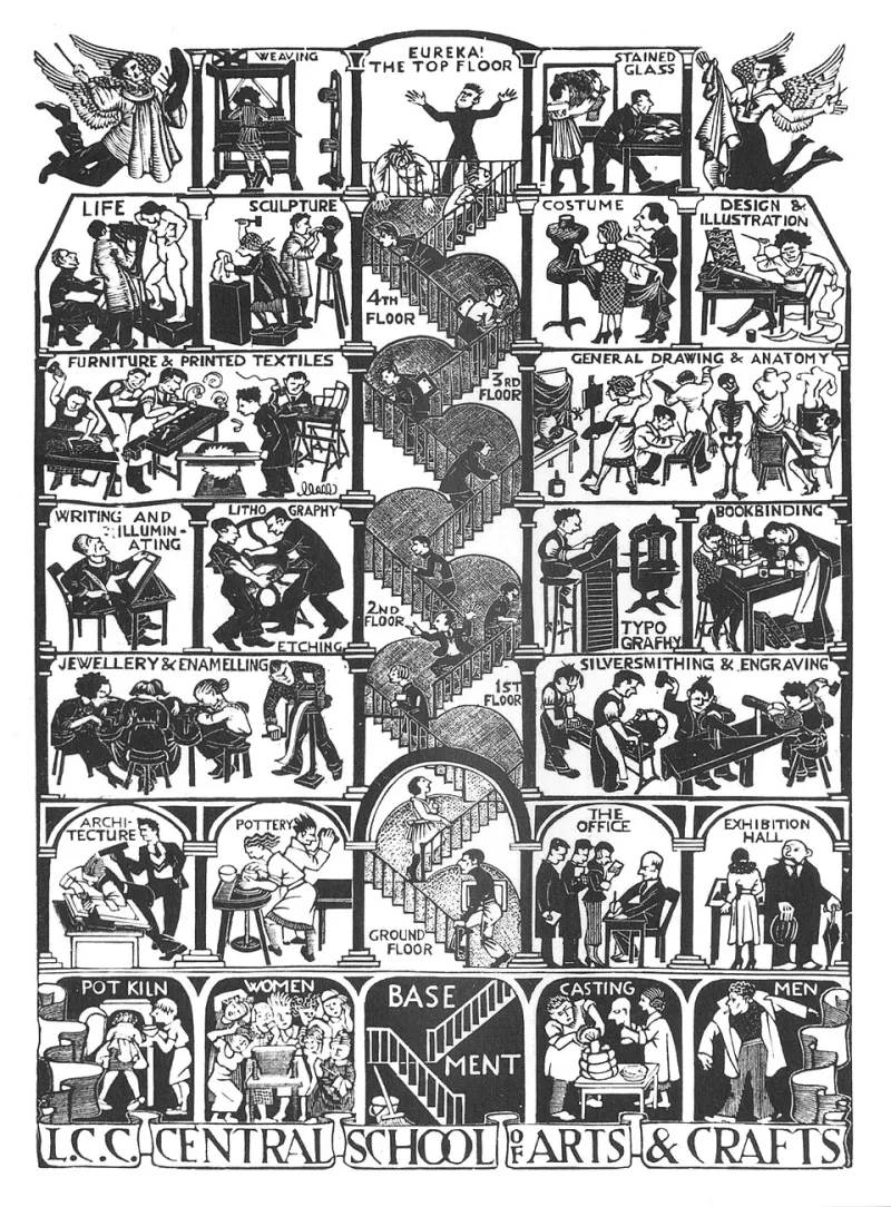
This is where the relief-print analogy earns its keep. A woodcut does not offer infinite gradation. It offers decisions: what gets cut away, what holds ink, what remains paper. A limited-ink grade works the same way. Each color must have a job. If a second accent enters, it should mark a change in pressure, not merely decorate a frame.
Several filmmakers describe rejecting the smoothness that digital grading can produce too easily. They want grain that behaves like paper tooth, halation that feels like ink bleed, and blacks that sit down rather than glow. The goal is not to fake celluloid. It is to let the image show its construction, which is consistent with the broader texture-first turn in American experimental shorts.
Why Three Inks Hold
Two-color schemes tend to produce stark graphic clarity. Three-color schemes allow a film to breathe without opening the whole spectrum. In both cases, the restriction creates continuity. A viewer may not consciously register that the same dull red has appeared in four scenes, but the recurrence builds a rhythm. When that red finally shifts, the shift lands.
Colorists point out that limited palettes also solve a practical problem for micro-cinema exhibition. Many small venues project at lower brightness than commercial theaters, with older lenses and imperfect room conditions. A grade that depends on subtle midtone separation can collapse in those spaces. A grade built on three clearly separated inks tends to survive. It holds contrast at the edges, keeps faces readable, and preserves the graphic punch that experimental shorts often rely on.
The mostcommon failure mode is literalism. A filmmaker decides on a blue-and-ochre palette and then applies it indiscriminately, so the film becomes a filter rather than a system. The stronger work assigns narrative weight to each ink. One color may belong to interiors, another to memory, a third to the moment the film breaks its own rules. The palette becomes a score, not a wash.
Paper Proofs and Projector Tests
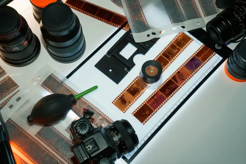
A recurring practice among the directors and colorists interviewed is proofing on paper. They print stills, sometimes at small scale, sometimes as contact sheets, and pin them in sequence. The paper proof exposes problems that a calibrated monitor can hide. A color that feels rich on screen may go muddy in print; a contrast that seems elegant in motion may read as flat when frozen. The proof sheet does not replace the grade, but it disciplines it.
Projector tests matter just as much. Filmmakers are asking micro-cinemas for ten-minute slots to run test reels before locking a grade. They want to see how the palette behaves under the venue's actual lamp, through its actual lens, on its actual screen. This is not overcaution. It is the difference between a look that works in a suite and a look that works in a room.
Some colorists now build two versions of a limited-palette grade: one for festival projection and one for online viewing. The differences are small but meaningful. The online version may lift the blacks slightly or reduce the harshest accent saturation so that compression does not turn a deliberate ink into a digital artifact. The theatrical version keeps the contrast intact.
A 2026 Checklist for the Limited-Ink Grade
For filmmakers considering a restricted palette in 2026, the following checklist reflects the working habits of the colorists and directors currently refining this approach.
- Define the palette before the edit is locked. Name each ink and assign it a narrative function.
- Proof the palette on paper. Print key frames, sequence them, and inspect them away from the monitor.
- Test the grade on the projection system you expect to use. If that is impossible, test on the closest available micro-cinema setup.
- Protect skin tones and essential information first. Restriction should not make a face unreadable or a subtitle illegible.
- Decide where the palette is allowed to break. A single violation can be more expressive than a hundred variations.
- Resist the urge to smooth. Keep grain, edge behavior, and ink-like imperfections unless they interfere with clarity.
- Build a separate online version only after the theatrical grade is locked. Do not let compression decisions drive the look.
The limited-palette short is not a retreat from color. It is a demand for color to mean something. In a market crowded with images that can become anything, the filmmakers choosing three inks are making a case for the opposite: a smaller vocabulary, used with greater conviction.