The Card Between Frames: Printed Dialogue and the Discipline of the Intertitle

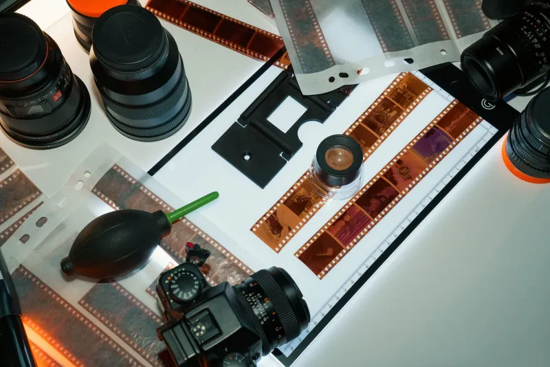
Photo: letterpress printed intertitle card on copy stand with 16mm film strips, via www.tori.ng
American experimental shorts have long treated the intertitle as a quotation from film history, a silent-era ornament revived for irony or archival texture. The current work is less nostalgic and more procedural. Filmmakers are setting dialogue in metal type, locking the form in a chase, printing on cotton rag or indexed card stock, and photographing the result on a copy stand before cutting it into the film. The card is not an overlay added in post. It is a physical object with a surface, a weight, and a registration mark. That material fact changes how the text behaves on screen.
The Card as an Edit
An intertitle is usually described as text. In practice it is a cut. The moment a card appears, the film suspends its image and asks the viewer to read. The moment it disappears, the film resumes with a different rhythm. In a printed workflow, that cut is decided twice: once at the printing table and again at the editing bench. The filmmaker chooses the type, the leading, the ink density, and the paper tone. Then the filmmaker chooses how long the card will remain on screen. Those decisions are not decorative. They are structural.
This is why the recent use of letterpress-style cards in American shorts feels distinct from the familiar subtitle. A subtitle is designed to be invisible, a transparent delivery system for dialogue. A printed intertitle is designed to be seen as an object. It has edges. It has impression. It has the small unevenness that comes from a hand-operated press. When a filmmaker cuts that card into a film, the audience is not merely reading a line. The audience is being shown a made thing.
Tempo, Not Transcription
Sync sound encourages a naturalistic tempo. Dialogue arrives when mouths move, pauses stretch according to performance, and the edit follows the body. Printed dialogue inverts that logic. The line arrives when the filmmaker decides it should arrive, and it stays for as long as the filmmaker decides it should stay. Reading speed is not universal, but the card imposes a duration anyway. That imposed duration is the point.
Several American experimental shorts now use this constraint as a pacing device. A card can hold a frame longer than a character would naturally pause. It can interrupt a gesture before the gesture completes. It can separate two images that would otherwise flow together and force the viewer to register the gap. The result is a film that breathes differently from a sync-sound short. The text does not serve the scene. The scene serves the text.
Authorship Under Pressure
The typographic choices matter. A hand-set line carries the evidence of decision: the width of the column, the spacing between letters, the slight bite of the impression. Even when the type is digital, the card is often printed and re-photographed so that the final image retains paper grain and ink unevenness. This is authorship in a literal sense. The filmmaker has made the words rather than merely recorded them.
There is also a practical economy at work. A short with printed dialogue can be shot mute, avoiding the cost of production sound, ADR, and the labor of matching lip movement. For filmmakers working with micro-budgets, that saving is not incidental. It moves resources from sound capture to pre-production design. The trade is clear: less money spent on sync, more time spent on the card. In a funding environment where American experimental shorts often survive on small grants and self-financing, that trade can determine whether a film gets finished.
The Festival Eye
Programmers who watch hundreds of shorts in a season learn to read signals quickly. A printed intertitle announces a different contract with the audience. It says that the film is willing to stop, to withhold, to make reading a visible act. That can be a liability in a market trained on invisible subtitles, where the goal is to keep the image unobstructed. But it can also be a signature. In a festival program, a card that looks printed rather than rendered stands out precisely because it refuses transparency.
Audiences raised on streaming subtitles may initially resist the interruption. The card asks for a different kind of attention. It does not float over the image; it replaces the image. That replacement is a formal assertion. The film is not illustrating a conversation. The film is arranging language and image as separate blocks, each with its own weight. For viewers willing to accept that arrangement, the intertitle becomes less a barrier than a beat.
Against Pastiche
None of this guarantees quality. The risk is decorative nostalgia, a silent-film look adopted without structural purpose. The stronger work uses the card as a device that can withhold, contradict, or redirect. A printed line can arrive before the image that explains it. It can repeat with a different typeface. It can be photographed at an angle, cropped, or scratched. The card is not a neutral vessel. It is a surface that can be damaged, and that damage can be part of the film.
By 2026, the intertitle's return is best understood not as a revival but as a reclassification. It belongs less to film history than to craft. It is a printed object placed between frames, an edit made in ink before it is made in the timeline. For American experimental shorts working with limited means and long attention, that object offers a way to control pace, assert authorship, and remind the viewer that cinema is not only recorded light. It is also pressure applied to paper.